The OpinionPanel Community
Website Redesign
Darren is a seriously effective UX specialist with the added benefit of being an excellent designer. We engaged Darren to help us understand and remedy a problem with our research panel website. We were experiencing declining conversion rates and we couldn't understand why. Darren's approach was rigorous but he managed to work at pace and he was highly communicative with my team, throughout. His concluding report and presentation were incredibly powerful and we're now working on implementing his full recommendations. Darren is effective, fast and professional - and he's a pleasure to work with. He comes with our hearty recommendations.
- Ben Marks CEO at YouthSight
YouthSight (now part of Savanta) is an award-winning market research agency and owner of the UK’s largest youth research panel, The OpinionPanel Community. Panellists share their opinions via focus groups and surveys, and the data is delivered to brands, universities, the media and the government to maximise their relationship with Gen Z and Millennials. In return, participants are rewarded with shopping vouchers and the opportunity to have their voices heard.
Client
outhSight (now part of Savanta)
Role
UX Design, UI Design
Date
Dec 2020 (Phase 1)
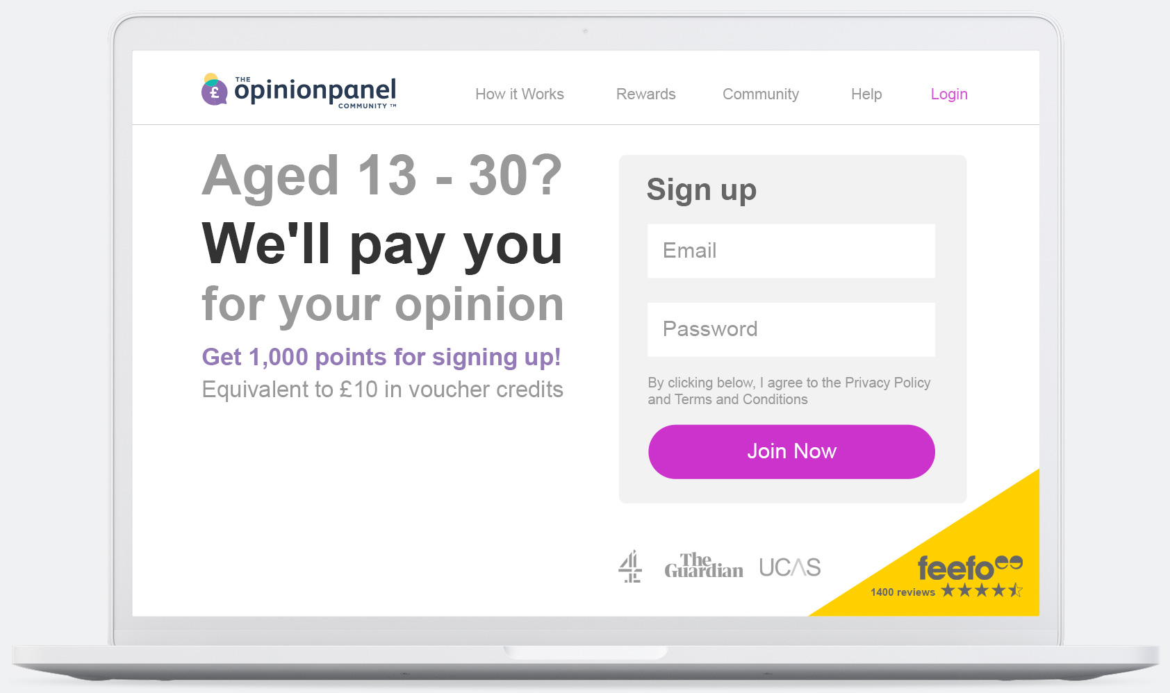
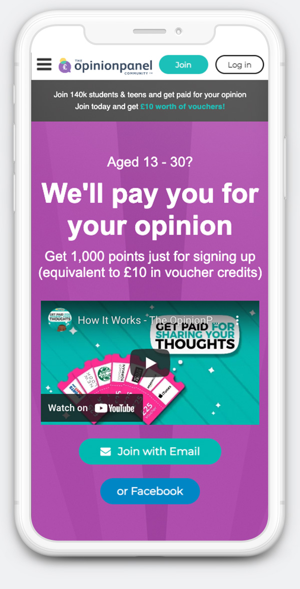
Above: Fulfilling the user's needs. The final design for the landing page.
Problem Statement
In the months before I was brought in, YouthSight had seen a drop in engagement with its online research panel, The OpinionPanel Community. The team had addressed what they could in-house using data and IT, but, not being UX experts, they were struggling to pin down the UX issues. I stepped in to offer UX guidance.
Below: The original designs with brand inconsistencies and poor placement of key user elements.
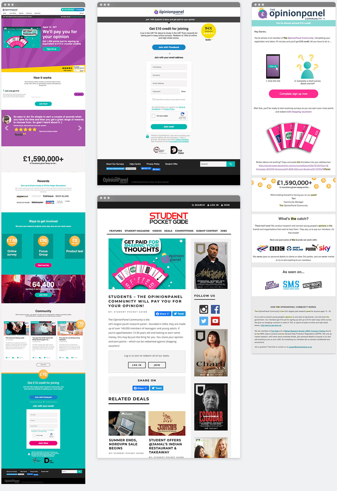
Above: Top left to right: Website, Sign-up page, Email, Advert.
UX Challenges
Working as YouthSight’s only UX designer was a good opportunity: it let me help shape and guide the organisation's design. It also brought significant challenges. For the first phase, to avoid overextending, I brought in a former colleague, an experienced UX lead.
Identifying the problem
Educating the company about UX
Establishing a UX process
Deciding which problem to solve
Project Goals
Improve the user experience for sign up
Redesign the landing view layout
Introduce mobile optimisation
Implement brand consistency across web, email and adverts
UX Solutions
Research Methods
Stakeholder interviews
Competitive UX Analysis
Focus Groups
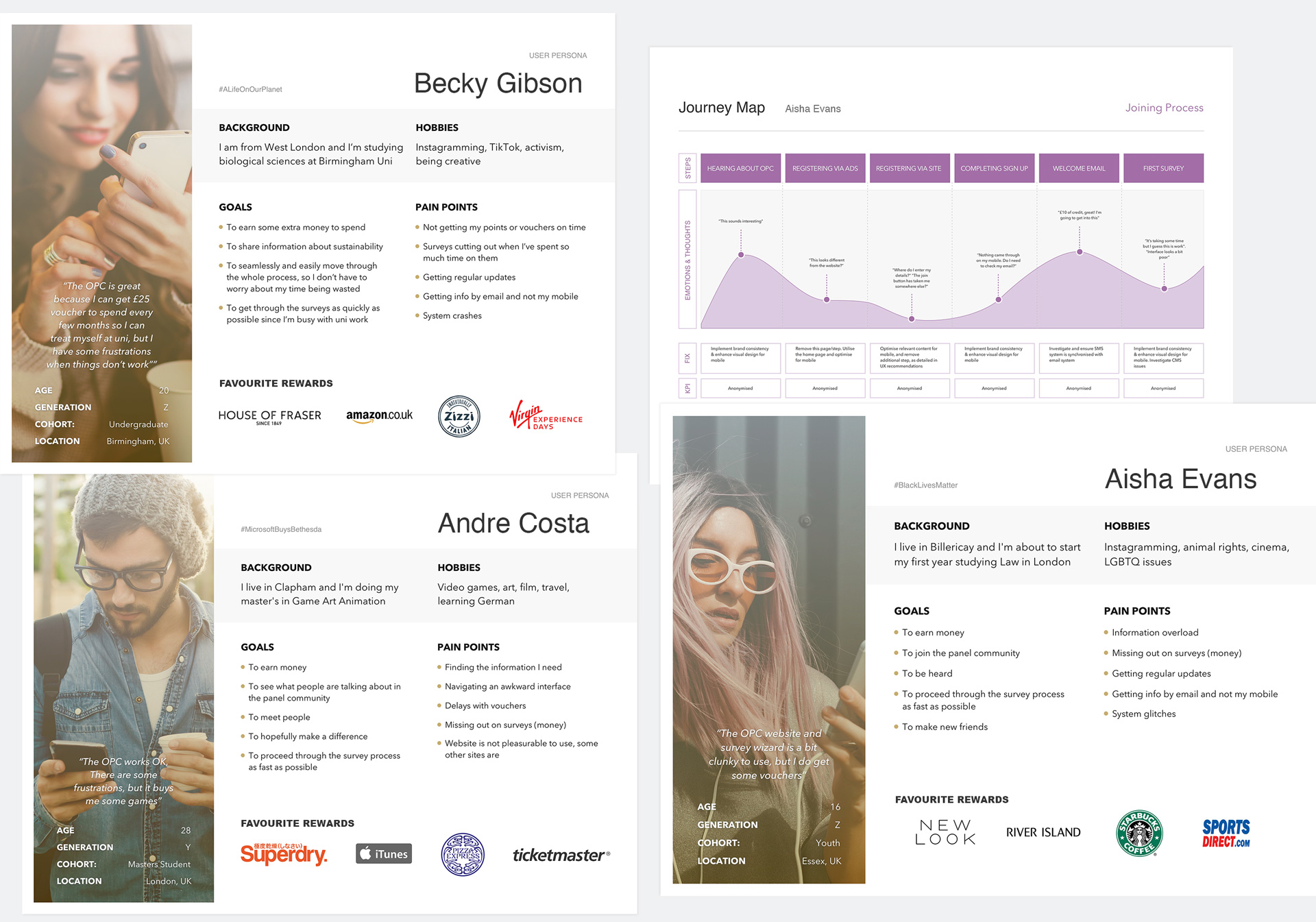
Personas
Customer Journey Map
Stakeholder Interviews
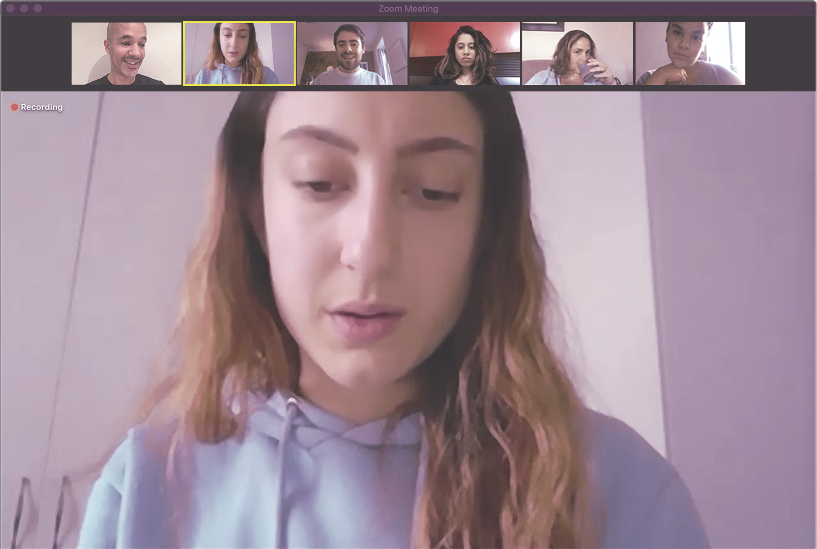
We conducted a number of stakeholder interviews to better understand the product, the users, and the problems the business was facing.
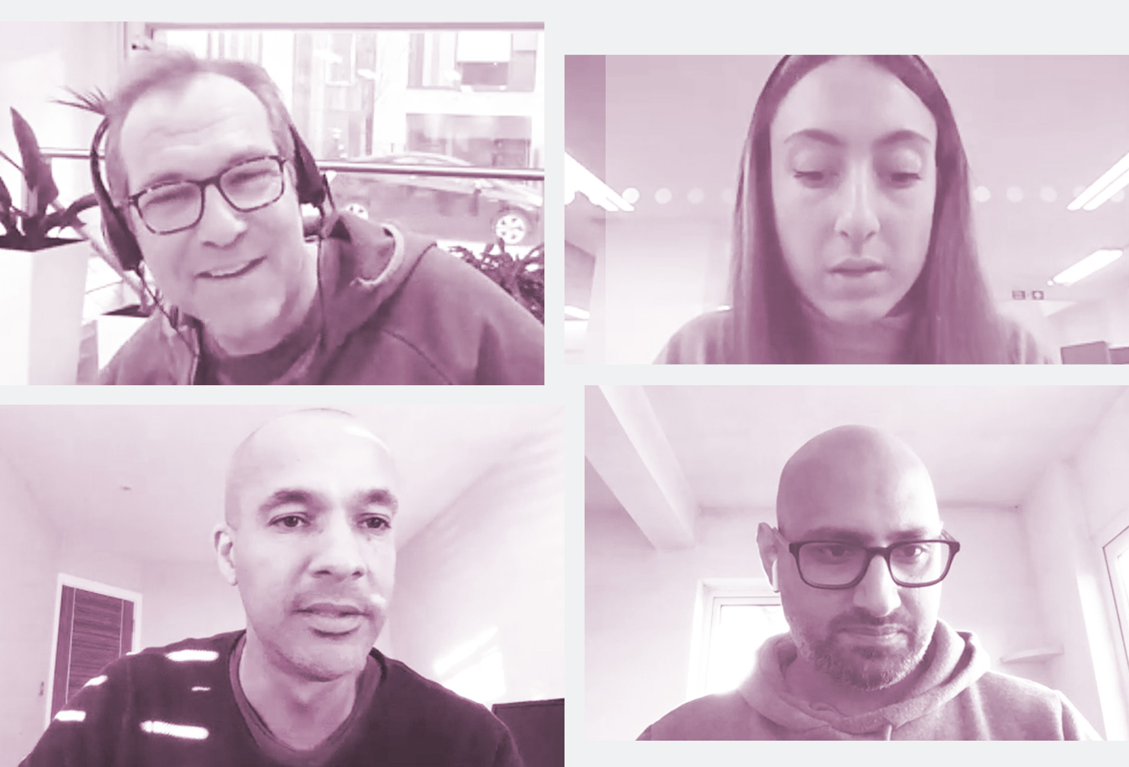
Above from top left: Ben Marks & Sophie Derham (YouthSight), myself & Anmol Nandha (UXers).
Insights
The OPC’s Gen Z and Millennial users consume content on mobiles
The OPC’s content is not fully optimised for mobile
The online research panel environment is highly competitive
Some competitors have advanced website technology
Narrowing the Scope
It was clear this project would need a UX team, requiring a significant amount of time, but this was not an option due to time and budget constraints. We agreed to compress the UX process and narrow the scope to focus on the joining process for the first phase of this project.
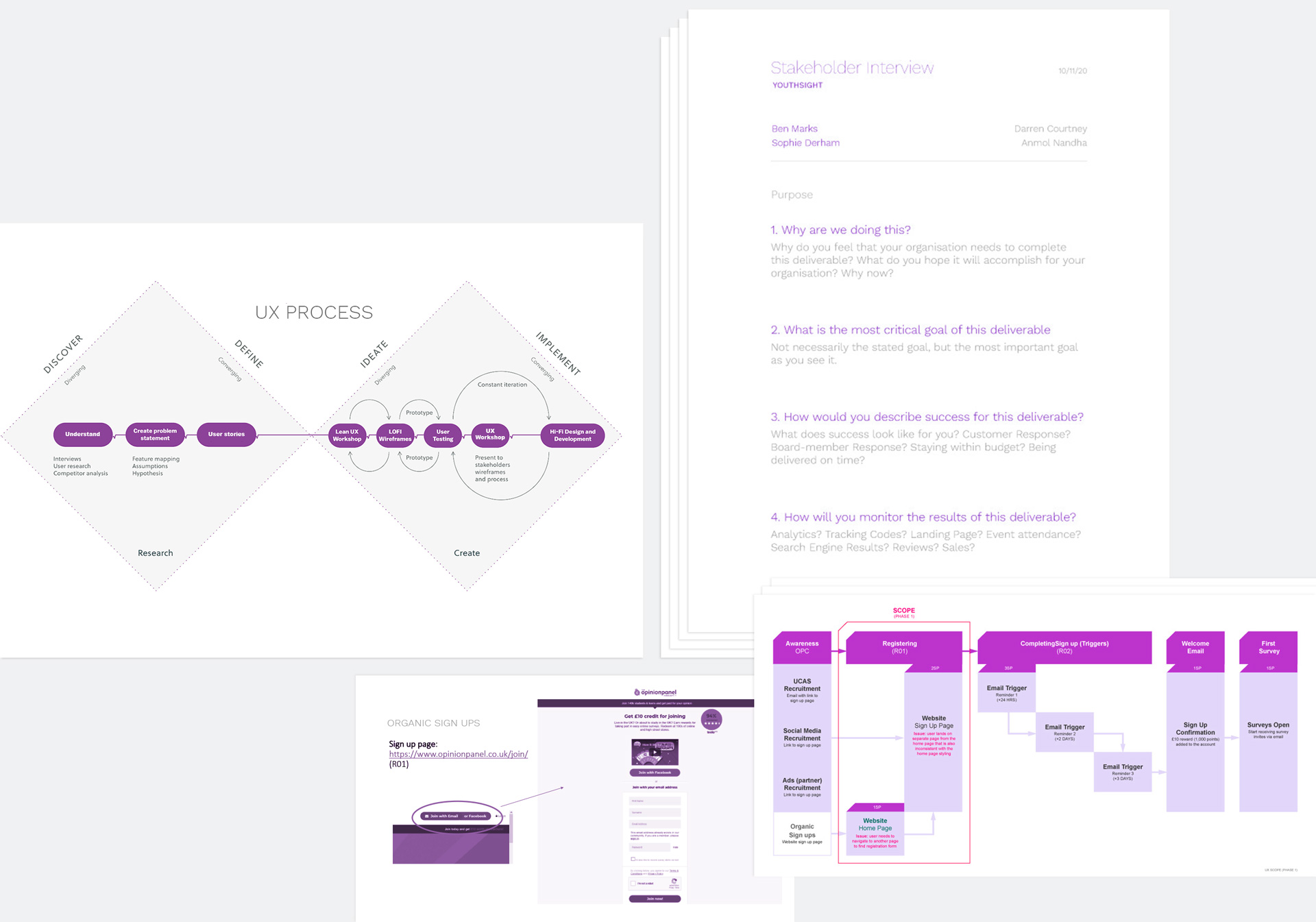
Above: Left to right: Explaining the UX process, Interview questions, Website sign up page, the OPC Registration process.
I created 3 personas and a customer journey map based on YouthSight’s OPC data.
Competitive UX Analysis
Using insights gathered from the Stakeholder interviews, I put together a simplified competitive analysis report.
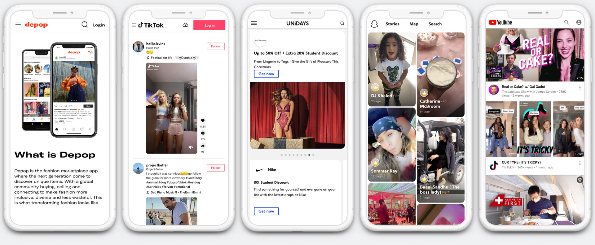
Above: Gen Z and Millennials' favourite platforms. All minimalistic, white and photographic.
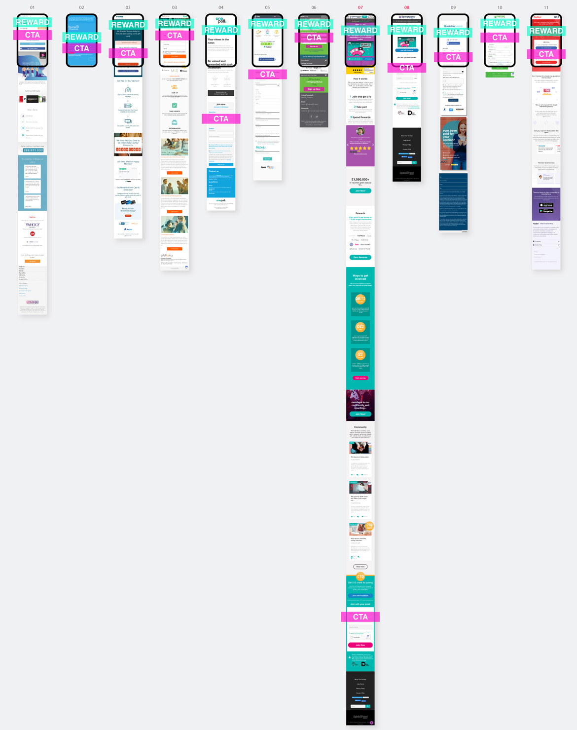
Rather than spending time developing a comprehensive list of strengths and weaknesses, I wanted to compare the landing pages of 10 competitors from the user's viewpoint on mobile. YouthSight had put thought into how the OPC content flowed on desktop, but not so much for mobile. I wondered if key elements such as the rewards and CTA were immediately viewable, the moment users landed.
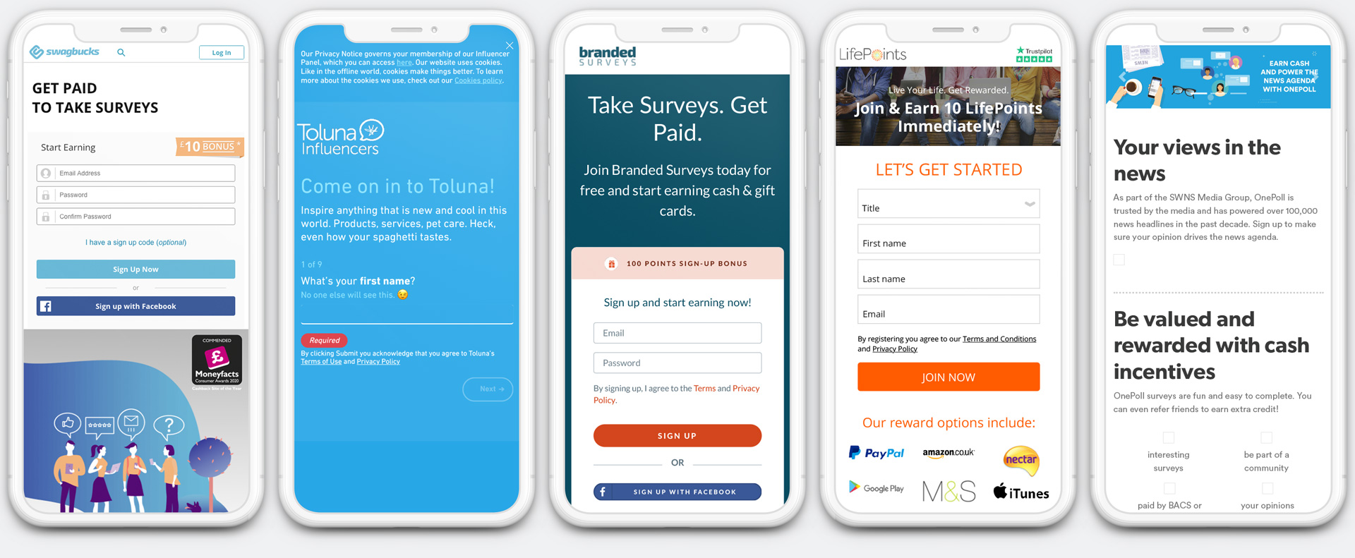
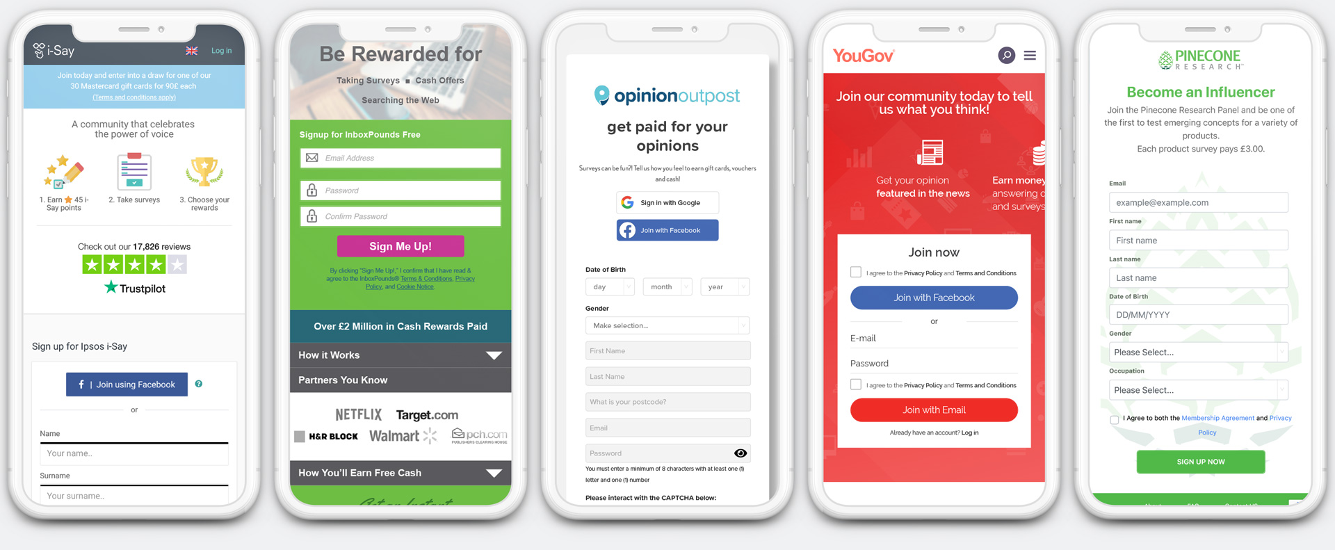
Above: The top 10 competitors. No need for scrolling as 90% of competitors clearly show the rewards & CTA when landing on the site.
At first, I made screen recordings, timing fundamental tasks such as navigating to the rewards, CTA and scrolling down to the bottom of the page. This was time-consuming and failed to give the elevated view I was after. I wanted to see all of the competitors' landing pages, side by side. Taking full-page mobile screenshots of each site, I laid them side by side in one document. I then added the mobile view frame at the top and mapped out the position of the reward and CTA in a comparable way. The resulting document was intriguing. 8 out of 10 competitor sites had the reward and CTA immediately viewable on mobile. The OPC's CTA was lost at the bottom of the longest home page of all competitors. This simple and effective comparison method highlighted a key issue and provided valuable insight, setting the foundation for the rest of the project.
Below: The visual competitive analysis revealed design flaws, strategies and opportunities. The OPC site (07) was the longest scroll, with too much information for one page. It also required the need to go to another page (08) to get to the CTA and reward.
Design Restructure
Following the findings of the competitive analysis, I rearranged the position and priority of key elements (CTA and Rewards) and created visuals for a revised landing page.
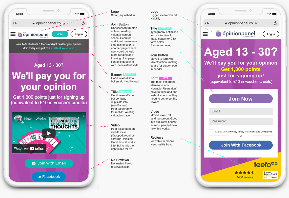
Above left: Original design, Right: New design concept.
Style Options
In preparation for the focus group sessions, I distilled the visual styles of the competitors into 3 stylistic versions of the OPC landing page: (A) current style, (B) minimal, and (C) photographic. We then set up focus groups of users to test our findings, assumptions, and design options.
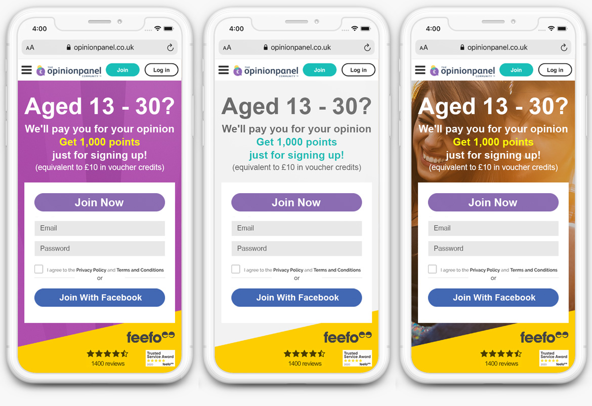
Above: Style choices for the focus group: (A) current, (B) minimal, and (C) photographic.
Focus Groups
We conducted several focus groups to help us assess user needs and feelings with the OPC and competitor sites. Participants performed fundamental tasks when landing on the sites. This helped uncover what users wanted from the system.
Insights
Users want to see the potential reward, as soon as they land
That’s why they’re here, to earn rewards, as quickly as possible
Users want to see the CTA sign-in screen, as soon as they land
They want to log in and start earning rewards, as quickly as possible
Users are not so interested in the ‘How it Works’ video
It’s a simple deal. They know how it works
Users like to see the Feefo feedback panel, as soon as they land
This helps inspire trust and shows real user feedback
Users like to see relationships with big brands
It shows credibility, clarifies purpose and showcases YouthSight's work
Users prefer the minimalist style
They want clean, simple, uncluttered interfaces, similar to the big brand sites they regularly use
Final Visual Design
The insights gained from the Focus Groups confirmed the findings in the competitive analysis. It proved extremely useful, revealing things we had not expected, such as the 'how it works' video not being as important as the business had previously thought. Learning from this and with the approval of the stakeholders, I proceeded to refine the minimalist design which was the users' clear favourite.
Using an iterative design process, where designs were continually evaluated with users and the business, I reached a design that matched the users' specific requirements.
Below: Before & After.
← Swipe the line on the image below →
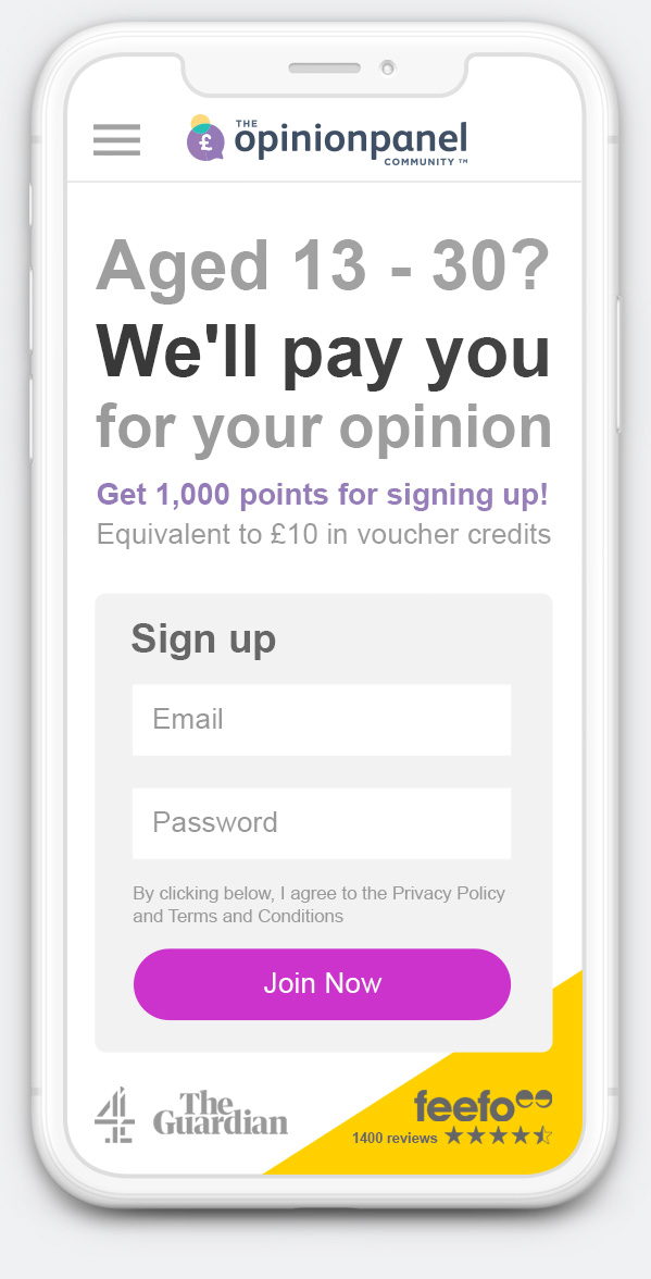
Above, left: User goals are difficult to achieve with the old design.
Above, right: User goals clearly presented in the new design.
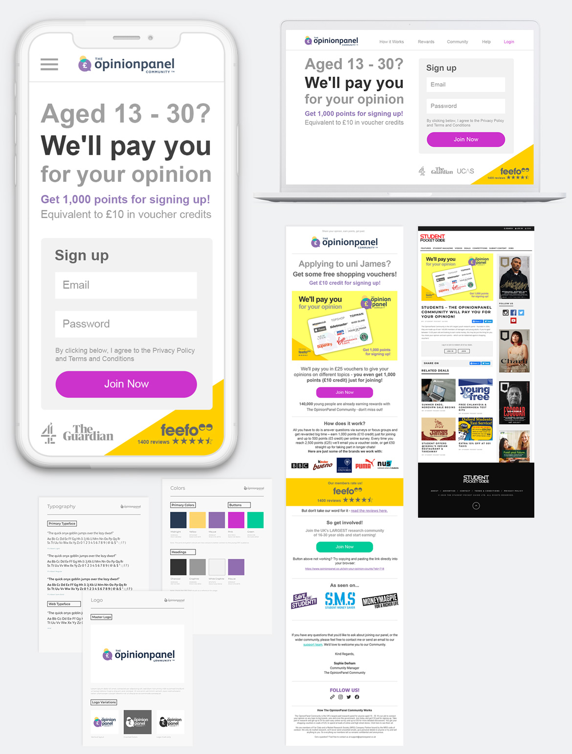
Below: Final visuals - Mobile, Desktop, Email & Advert Concept & Style Guide.
The OpinionPanel Community
Outcome & Learnings
The biggest challenge was the limited time and UX support. Even so, the competitive analysis and focus groups produced a clear, user-tested design direction that both the business and users were happy with.
One change made during phase one gave an early signal it was working: moving the sign-up form closer to the landing view, which the business linked to an increase in engagement and registrations. I handed over the validated design and the research behind it as the foundation for a fuller rollout in a later phase.
UX Design
Darren Courtney
UX Guide & Support
Anmol Nandha
YouthSight
Ben Marks
(CEO)
Josephine Hansom
(Managing Director)
Kate Robinson
(Head of Marketing)
Sophie Derham
(Marketing Executive)
Request CV darren@xdc.design
© 2026 Darren Courtney. All rights reserved.